library(tidyverse)
library(ggthemes)
library(gganimate)
library(mgcv)
library(itsadug)Last week, I presented some work that Lisa Johnson and I have been working on. We discussed ways that vowel formant trajectories can help us learn more about vowel mergers. What seemed to get the most attention though were the data visuals that I created for the talk.
Just when I thought I couldn’t be more impressed with @joey_stan ’s data viz game, he pulls out these animated vowel trajectories! #LSA2022 pic.twitter.com/ZzKqvOWoR0
— Nicole Holliday (@mixedlinguist) January 7, 2022
Here’s what that image looks like up close:
My friend Andrew Bray recommended I do a tutorial on how to do them:
Thanks for the idea, Andrew!
After @joey_stan teaches us all how to do it, trajectory gifs need to become the norm. #LSA2022
— Andrew Bray (@arbray01) January 7, 2022
I haven’t done a cool tutorial for a while and I thought it might make for a good one. So, in this blog post, I’ll show you my step-by-step process for how I made that animation. It’s a little long because I’ve tried to explain the reasoning for why I did what I did. I guess it just shows how much work goes into a nice visual I suppose. Anyway, hopefully you can make it too with your own data!
Load the data
I’ll start by loading the data that I used in the presentation.
heber <- read_csv("lsa2022.csv") %>%
  print()
# A tibble: 8,409 × 9
# Groups: token_id [807]
token_id speaker word allophone percent F1_norm F2_norm yob start_event
<chr> <fct> <fct> <fct> <dbl> <dbl> <dbl> <dbl> <lgl>
1 UT008-Jani… UT008-… kneel ZEAL 0 0.464 2.82 1958 TRUE
2 UT008-Jani… UT008-… kneel ZEAL 0.1 0.434 2.88 1958 FALSE
3 UT008-Jani… UT008-… kneel ZEAL 0.2 0.478 2.81 1958 FALSE
4 UT008-Jani… UT008-… kneel ZEAL 0.3 0.524 2.27 1958 FALSE
5 UT008-Jani… UT008-… kneel ZEAL 0.6 0.619 1.11 1958 FALSE
6 UT008-Jani… UT008-… kneel ZEAL 0.8 0.387 0.960 1958 FALSE
7 UT008-Jani… UT008-… kneel ZEAL 0.9 0.392 1.04 1958 FALSE
8 UT008-Jani… UT008-… kneel ZEAL 1 0.631 1.30 1958 FALSE
9 UT008-Jani… UT008-… built GUILT 0.1 0.430 2.39 1958 TRUE
10 UT008-Jani… UT008-… built GUILT 0.2 0.455 2.36 1958 FALSE
# ℹ 8,399 more rowsThis data has already been processed a little bit. Formants were extracted using FastTrack, and from there I did a bit of cleaning and normalization and whatnot. For simplicity in this blog post, I’ll only work with the allophones ZEAL and GUILT (which are /il/ and /ɪl/, respectively). To make it possible to run the GAMM, I’ll then convert charactater vectors to factors, and I’ll add the start_event column. For more information on prepping for GAMMs, see Sóskuthy (2017).
See this blog post where I introduce these Wells-inspired labels for prelateral vowels.
Fit the GAMMs
Now it’s time to actually fit the GAMMs. This one is, relatively speaking, not too complicated. First, the dependent variable is the normalized F1 measurements. As predictors, I have allophone as a fixed effect which allows the model to have each allophone’s predicted measurements be at different heights (in normalized Hz). I then have percent as a smooth by allophone, which allows the model to fit a curve from the onset to the offset of the vowel, independently for each allophone. I also have a smooth for birth year (yob) by allophone, which allows the model to fit a curvey from the earliest birth year to the latest birth year, independently for each allophone. The next line (with the ti() function), is the juicy one: it’s the interaction between percent and birth year (yob), which allows the curved line fit from the onset to the offset of the vowel to vary freely as it progresses across birth years. The last two rows include speaker and word as random smooths, by allophone.
I’ll fit the exact same model twice: once for F1 and again for F2. To avoid repetitive code and potential human error, I’ll use update to change the dependent variable of the model.
f1_gamm <- bam(F1_norm ~ allophone +
      s(percent, by = allophone) +
      s(yob, by = allophone) +
      ti(percent, yob, by = allophone) +
      s(speaker, percent, by = allophone, bs = "fs", m=1) + # I removed xt = "cr",
      s(word,    percent, by = allophone, bs = "fs", m=1),
    data = heber,
    discrete = TRUE)

f2_gamm <- update(f1_gamm, F2_norm ~ .)
To avoid autocorrelation in the data, I’ll get the rho values from each model and rerun them with this rho parameter. See Sóskuthy (2017) for more information.
f1_gamm_rho <- start_value_rho(f1_gamm)
f2_gamm_rho <- start_value_rho(f2_gamm)

f1_gamm <- update(f1_gamm, rho = f1_gamm_rho, AR.start = heber$start_event)
f2_gamm <- update(f2_gamm, rho = f2_gamm_rho, AR.start = heber$start_event)
Okay, now that we’ve got some GAMMs fit to the data, we can extract predicted measurements. Here’s where where use the itsadug package. I’ll get predicted measurements for both ZEAL and GUILT, for every year from 1920 to 2000, and—here’s the kicker—at a thousand equidistant points within the vowel. Actually, 1001 to avoid fencepost errors reasons, and after chopping off the first and last 10% of the vowel to avoid consonantal effects. I’ve found that kind of fidelity is what makes for some really smooth-looking plots. It also makes so that it takes a several minutes to extract predicted measurements.
f1_preds <- get_predictions(f1_gamm,
                            cond = list(
                              allophone = c("ZEAL", "GUILT"),
                              yob = 1920:2000,
                              percent = seq(0.1, 0.9, length = 1001)),
                            rm.ranef = TRUE,
                            print.summary = FALSE)
f2_preds <- get_predictions(f2_gamm,
                            cond = list(
                              allophone = c("ZEAL", "GUILT"),
                              yob = 1920:2000,
                              percent = seq(0.1, 0.9, length = 1001)),
                            rm.ranef = TRUE,
                            print.summary = FALSE)
At this point, we’re ready to combine the two datasets and do a little bit of light processing.
preds <- bind_rows(`F1` = f1_preds, `F2` = f2_preds, .id = "formant") %>%
  select(-rm.ranef, -speaker, -word) %>%
  rename(hz_norm = fit)
head(preds)
formant allophone percent yob hz_norm CI
1 F1 ZEAL 0.1000 1920 0.4013465 0.05088054
2 F1 GUILT 0.1000 1920 0.4853472 0.05443935
3 F1 ZEAL 0.1008 1920 0.4012991 0.05085728
4 F1 GUILT 0.1008 1920 0.4856286 0.05441697
5 F1 ZEAL 0.1016 1920 0.4012518 0.05083414
6 F1 GUILT 0.1016 1920 0.4859101 0.05439473We now have 324,324 rows. The reason it’s so huge is because there are 1001 predicted formant measurements, for each year from 1920 to 2000, for each formant, for each allophone. That’s a lot of data.
Basic plots
Okay, now we’re ready for some visuals. As a sanity check, let’s plot this data in the F1-F2 space. That means I’ll quickly have to reshape the data so that F1 and F2 are in separate columns. I’ll use the predicted measurements from 1920 for this plot.
See this blog post on all about using
pivot_wider on vowel data.preds %>%
pivot_wider(names_from = formant, values_from = c(hz_norm, CI)) %>%
filter(yob == 1920) %>%
ggplot(aes(hz_norm_F2, hz_norm_F1, color = allophone)) +
geom_path(arrow = joeyr::joey_arrow()) +
scale_x_reverse() +
scale_y_reverse() +
theme_bw()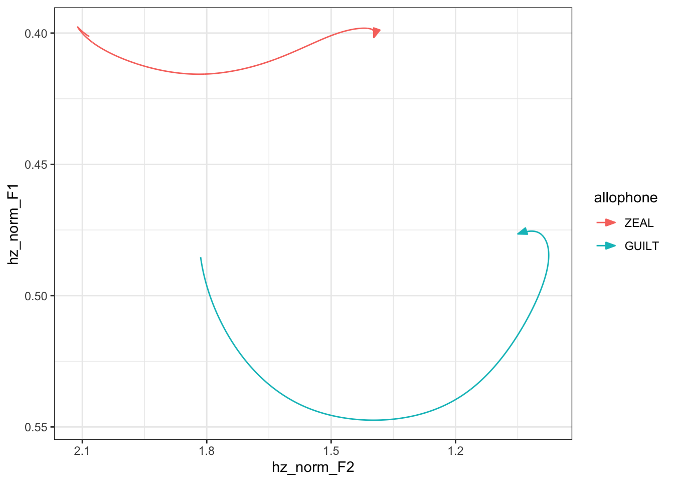
Okay, looks decent enough. Let’s plot that same data but in a way that imitates a spectrogram. I’ll facet it by formant so that F1 and F2 have equal space in the plot.
preds %>%
  filter(yob == 1920) %>%
  ggplot(aes(percent, hz_norm, color = allophone)) +
  geom_path() +
  facet_wrap(~formant, ncol = 1, scales = "free") +
  theme_bw()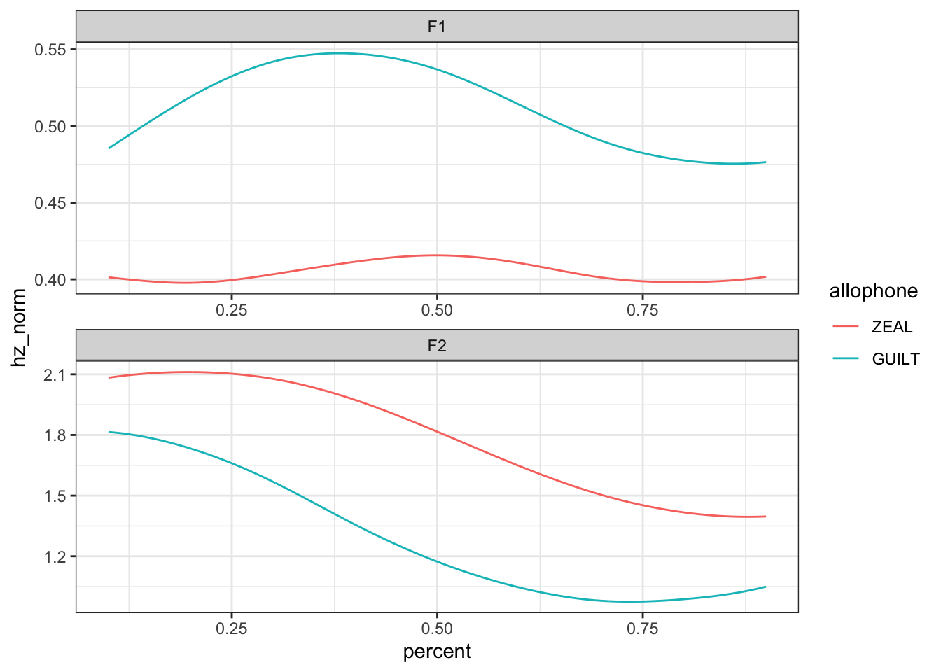
Okay, now that we’ve got the basic gist of the plot, we’re ready to make it a nicer!
Sprucing up the plots
If you’ve seen my vowel plots, you know that I like to make things a little bit fancier than what basic ggplot2 does for you. Some things are driven by principles of data visualization, some are aesthetics, and some are just for personal taste.
- I’ll reverse the order of F1 and F2 so that F2 is on top, better imitating a spectrogram. I do that using
fct_revwithinmutateas a pre-processing stage, before the actualggplotcall. - I’ll change the colors so that they’re a little nicer and colorblind friendly using the
scale_color_ptolfunction in theggthemespackage. This uses Paul Tol’s color schemes, which you can read more about here. - I’ll also add a title and make the y-axis label a little less code-y with
labs.
- I’ll change the x-axis ticks so that they line up with values that are more meaningful (what is halfway between 0.5 and 0.25?) with
scale_y_continuous.
Pretty sure the first time I saw these themes was in this presentation that Joe Fruehwald gave.
From here on out I’ll only put comments in the code where code has changed. Or to divide major sections of code.
preds %>%
  filter(yob == 1920) %>%
  mutate(formant = fct_rev(formant)) %>%
  ggplot(aes(percent, hz_norm, color = allophone)) +
  geom_path() +
  scale_x_continuous(breaks = seq(0, 1, by = 0.1)) +
  scale_color_ptol() +
  facet_wrap(~formant, ncol = 1, scales = "free") +
  labs(title = "Predicted trajectories for ZEAL and GUILT: birth year = 1920",
       y = "frequency (normalized)") +
  theme_bw()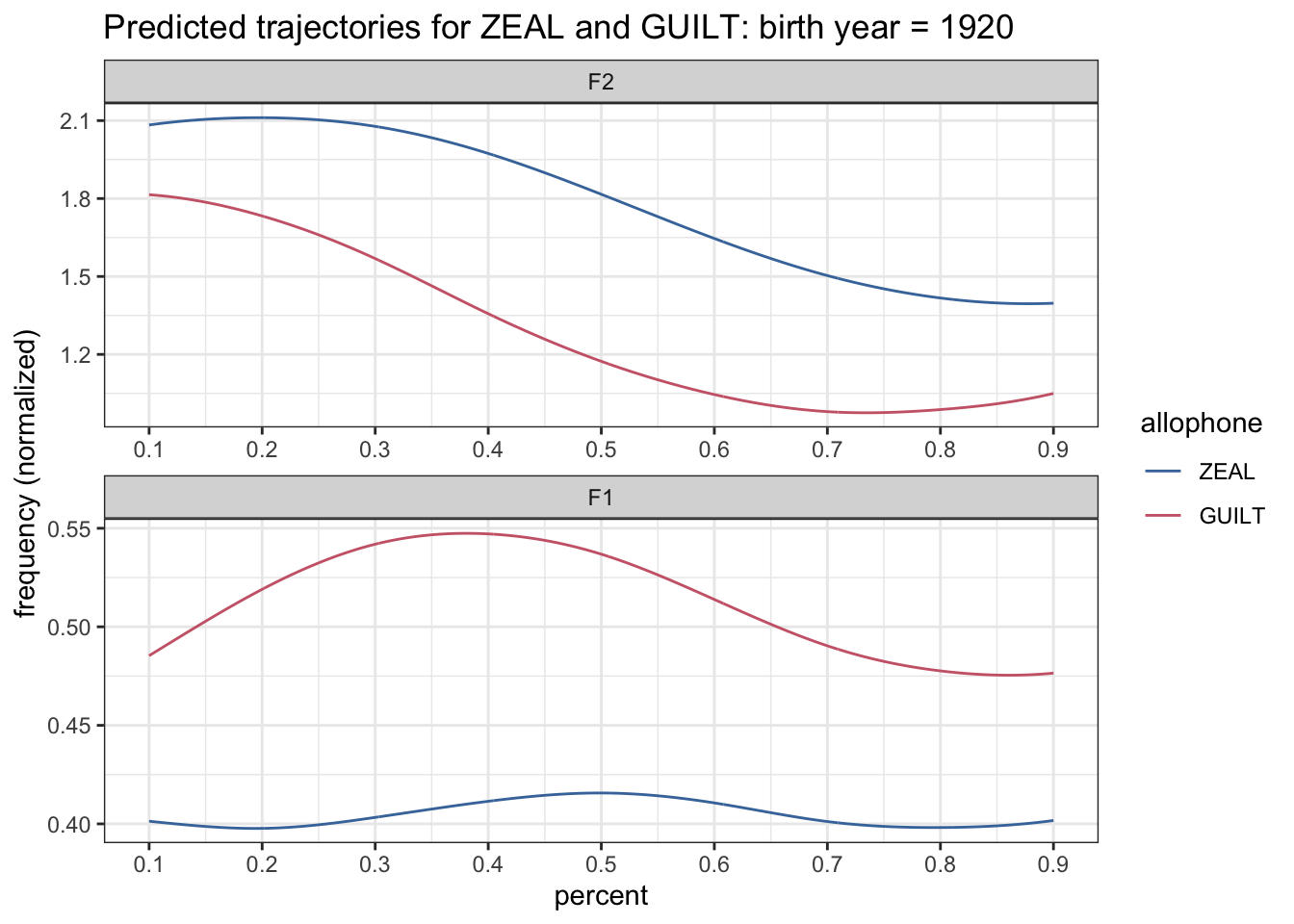
Already, that version of the plot looks a lot crisper than the earlier one.
Adding confidence intervals
From this point on, I’ll do a little more of a step-by-step walk-through of the plot so that you can see what each part does and why I did it that way.
Once crucial element for our plot is that we want to see the confidence intervals. We’ll do that with geom_ribbon and use the CI column in our data to help determine the width.
preds %>%
  filter(yob == 1920) %>%
  mutate(formant = fct_rev(formant)) %>%
  ggplot(aes(percent, hz_norm, color = allophone)) +
  geom_ribbon(aes(ymin = hz_norm - CI, ymax = hz_norm + CI)) +
  geom_path() +
  scale_x_continuous(breaks = seq(0, 1, by = 0.1)) +
  scale_color_ptol() +
  facet_wrap(~formant, ncol = 1, scales = "free") +
  labs(title = "Predicted trajectories for ZEAL and GUILT: birth year = 1920",
       y = "frequency (normalized)") +
  theme_bw()
Okay, so that’s not pretty. Let’s make it lighter. I’ll set the color of these bands intervals to be "gray75" which is kinda like a shade of gray three-quarters of the way from black to white. I always forget this when I make plots, but this is done with the fill argument rather than the color argument.
preds %>%
  filter(yob == 1920) %>%
  mutate(formant = fct_rev(formant)) %>%
  ggplot(aes(percent, hz_norm, color = allophone, group = allophone)) +
  geom_ribbon(aes(ymin = hz_norm - CI, ymax = hz_norm + CI), fill = "grey75") +
  geom_path() +
  scale_x_continuous(breaks = seq(0, 1, by = 0.1)) +
  scale_color_ptol() +
  facet_wrap(~formant, ncol = 1, scales = "free") +
  labs(title = "Predicted trajectories for ZEAL and GUILT: birth year = 1920",
       y = "frequency (normalized)") +
  theme_bw()
OKay that almost works, but when the two overlap the red on is on top. So, I’ll set the alpha level (= transparency) to be 0.5 so that we can see overlapping areas a little better.
preds %>%
  filter(yob == 1920) %>%
  mutate(formant = fct_rev(formant)) %>%
  ggplot(aes(percent, hz_norm, color = allophone)) +
  geom_ribbon(aes(ymin = hz_norm - CI, ymax = hz_norm + CI), fill = "grey75", alpha = 0.5) +
  geom_path() +
  scale_x_continuous(breaks = seq(0, 1, by = 0.1)) +
  scale_color_ptol() +
  facet_wrap(~formant, ncol = 1, scales = "free") +
  labs(title = "Predicted trajectories for ZEAL and GUILT: birth year = 1920",
       y = "frequency (normalized)") +
  theme_bw()
There we go, now we can see the bands. The problem I have now is that I don’t really want the edges of the ribbons to be colored—I’d rather they just be gray. If you look at the code, the color = allophone argument is in the main ggplot function, which means it’ll apply to all layers in the plot where relevant (here, geom_ribbon and geom_path). Instead, I only want it to apply to one layer, geom_path. So I’ll just move it to that function instead.
preds %>%
  filter(yob == 1920) %>%
  mutate(formant = fct_rev(formant)) %>%
  ggplot(aes(percent, hz_norm)) +
  geom_ribbon(aes(ymin = hz_norm - CI, ymax = hz_norm + CI), fill = "grey75", alpha = 0.5) +
  geom_path(aes(color = allophone)) +
  scale_x_continuous(breaks = seq(0, 1, by = 0.1)) +
  scale_color_ptol() +
  facet_wrap(~formant, ncol = 1, scales = "free") +
  labs(title = "Predicted trajectories for ZEAL and GUILT: birth year = 1920",
       y = "frequency (normalized)") +
  theme_bw()
Well great, what happened here? The ribbons are now really faded or something. As it turns out, when geom_ribbon was inheriting the color = allophone argument, that was what kept the two ribbons distinct from each other. Now, there’s nothing in the geom_ribbon function or its inherited aesthetics from ggplot that is distinguishing ZEAL from GUILT. I don’t want to put color back in. So instead, I’ll put group = allophone. That’ll tell it to group things by allophone. I’ll go ahead and put that in the main ggplot call because it won’t affect geom_path.
preds %>%
  filter(yob == 1920) %>%
  mutate(formant = fct_rev(formant)) %>%
  ggplot(aes(percent, hz_norm, group = allophone)) +
  geom_ribbon(aes(ymin = hz_norm - CI, ymax = hz_norm + CI), fill = "grey75", alpha = 0.5) +
  geom_path(aes(color = allophone)) +
  scale_x_continuous(breaks = seq(0, 1, by = 0.1)) +
  scale_color_ptol() +
  facet_wrap(~formant, ncol = 1, scales = "free") +
  labs(title = "Predicted trajectories for ZEAL and GUILT: birth year = 1920",
       y = "frequency (normalized)") +
  theme_bw()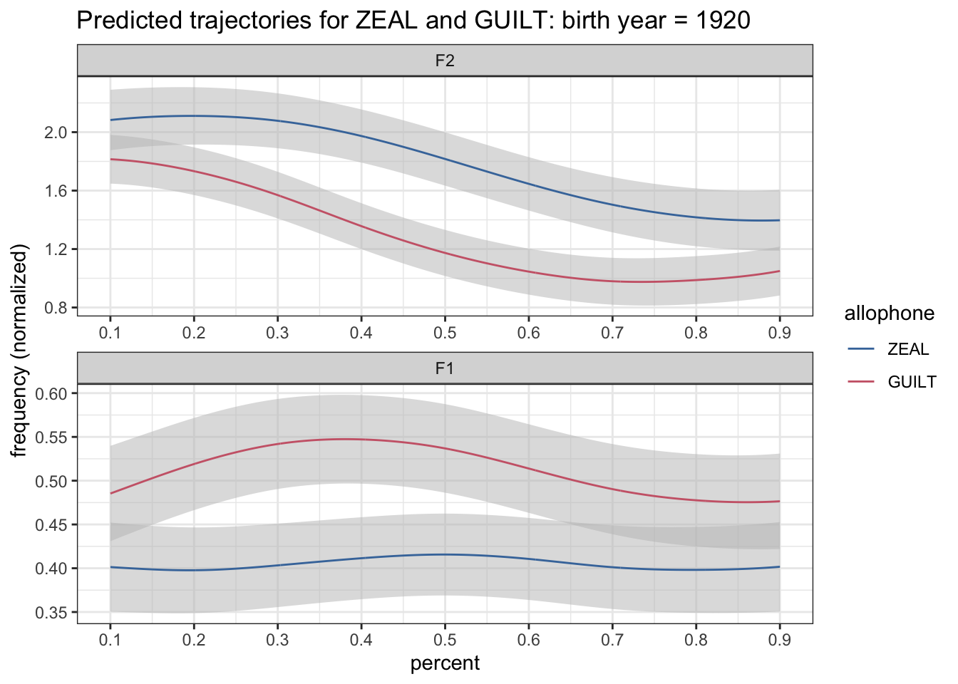
Okay, so now we’ve got some decent-looking ribbons.
Indicate significance
In my LSA presentation I had several things in the plot to help indicate where the confidence intervals overlapped. Let’s take a look at that real quick.
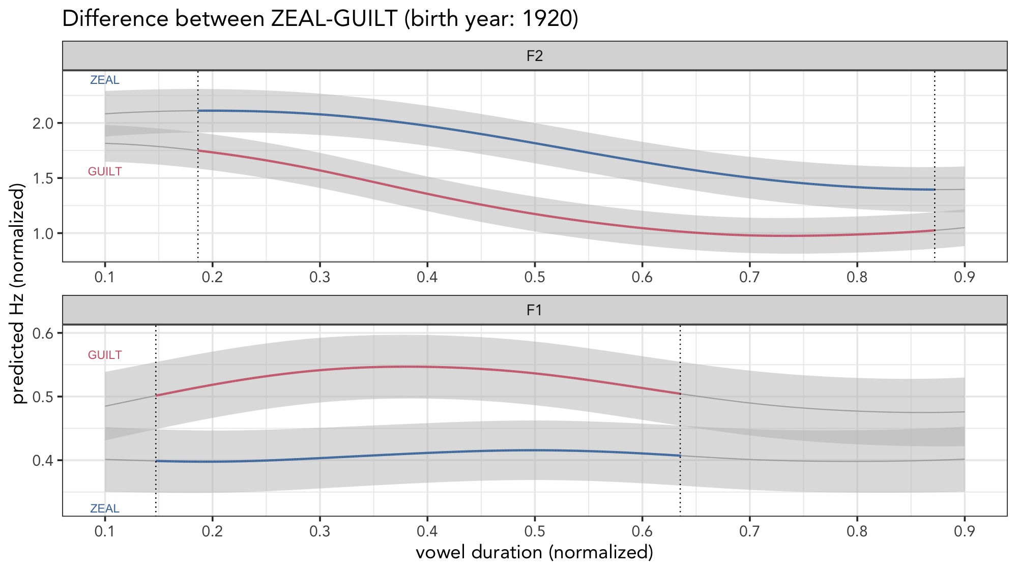
So, there are several things going on here.
- Where the confidence intervals overlap, the color of the line turns to a darker gray.
- If you look closely, the size of the gray line is thinner than the colored lines.
- A dotted vertical black line indicates the crossing point.
So, what we need to do is figure out not only where along the duration of the vowel the confidence intervals overlap, but we also need to figure out that crossing point. The first task is pretty straightforward. The second is a bit more complicated. The third is surprisingly tricky. Let’s start with the first.
Finding where confidence intervals overlap
To begin, let’s look at the structure of our data as is so we know what we’re working with.
preds %>%
  filter(yob == 1920) %>%
  head()
formant allophone percent yob hz_norm CI
1 F1 ZEAL 0.1000 1920 0.4013465 0.05088054
2 F1 GUILT 0.1000 1920 0.4853472 0.05443935
3 F1 ZEAL 0.1008 1920 0.4012991 0.05085728
4 F1 GUILT 0.1008 1920 0.4856286 0.05441697
5 F1 ZEAL 0.1016 1920 0.4012518 0.05083414
6 F1 GUILT 0.1016 1920 0.4859101 0.05439473We’ve got F1 and F2 predictions in the same column (hz_norm). Since we need F1 and F2 to talk to each other to see if they overlap, the first step that we’ll need to do is to reshape the data so that F1 and F2 are in separate columns. This puts the predicted F1 and F2 measurements from any vowel token from any percent on the same row. We’ll do that the same way that we did it previously. We really want the predicted formant values and the confidence intervals so be sure to put both hz_norm and CI in the values_from argument of pivot_wider.
preds %>%
  filter(yob == 1920) %>%
  # Reshape
  pivot_wider(names_from = allophone, values_from = c(hz_norm, CI)) %>%
  print()
# A tibble: 2,002 × 7
formant percent yob hz_norm_ZEAL hz_norm_GUILT CI_ZEAL CI_GUILT
<chr> <dbl> <int> <dbl> <dbl> <dbl> <dbl>
1 F1 0.1 1920 0.401 0.485 0.0509 0.0544
2 F1 0.101 1920 0.401 0.486 0.0509 0.0544
3 F1 0.102 1920 0.401 0.486 0.0508 0.0544
4 F1 0.102 1920 0.401 0.486 0.0508 0.0544
5 F1 0.103 1920 0.401 0.486 0.0508 0.0544
6 F1 0.104 1920 0.401 0.487 0.0508 0.0543
7 F1 0.105 1920 0.401 0.487 0.0507 0.0543
8 F1 0.106 1920 0.401 0.487 0.0507 0.0543
9 F1 0.106 1920 0.401 0.488 0.0507 0.0543
10 F1 0.107 1920 0.401 0.488 0.0507 0.0542
# ℹ 1,992 more rowsAt this point, it’s pretty straightforward math: if the predicted line for ZEAL plus its confidence interval is lower than the predicted line for GUILT minus its confidence interval, than the difference is significant.
preds %>%
  filter(yob == 1920) %>%

  # Reshape
  pivot_wider(names_from = allophone, values_from = c(hz_norm, CI)) %>%

  # Calculate the difference
  mutate(is_significant = hz_norm_ZEAL + CI_ZEAL < hz_norm_GUILT - CI_GUILT) %>%

  print()
# A tibble: 2,002 × 8
formant percent yob hz_norm_ZEAL hz_norm_GUILT CI_ZEAL CI_GUILT
<chr> <dbl> <int> <dbl> <dbl> <dbl> <dbl>
1 F1 0.1 1920 0.401 0.485 0.0509 0.0544
2 F1 0.101 1920 0.401 0.486 0.0509 0.0544
3 F1 0.102 1920 0.401 0.486 0.0508 0.0544
4 F1 0.102 1920 0.401 0.486 0.0508 0.0544
5 F1 0.103 1920 0.401 0.486 0.0508 0.0544
6 F1 0.104 1920 0.401 0.487 0.0508 0.0543
7 F1 0.105 1920 0.401 0.487 0.0507 0.0543
8 F1 0.106 1920 0.401 0.487 0.0507 0.0543
9 F1 0.106 1920 0.401 0.488 0.0507 0.0543
10 F1 0.107 1920 0.401 0.488 0.0507 0.0542
# ℹ 1,992 more rows
# ℹ 1 more variable: is_significant <lgl>At this point, we can now just revert the shape, and we’re ready to plot. Reverting the shape with pivot_longer isn’t trivial, because it uses some regex and a special trick with ".value" that lets you split the resulting column into two. I encourage you to look at a previous blog post of mine about reshaping data.
I again encourage you to look at this blog post on all about using
pivot_wider on vowel data.I’ll incorporate this new information by changing the color of the lines to map to the is_significant column. I’ll also add the size aesthetic and map it to is_significant too. Finally, I’ll control the size by adding scale_size_manual. I’ll purposely exaggerate the difference so we can make sure they’re doing what we want.
preds %>%
  filter(yob == 1920) %>%


  # Reshape
  pivot_wider(names_from = allophone, values_from = c(hz_norm, CI)) %>%

  # Calculate the difference
  mutate(is_significant = hz_norm_ZEAL + CI_ZEAL < hz_norm_GUILT - CI_GUILT) %>%

  pivot_longer(cols = c(matches("hz_norm"), matches("CI")),
               names_to = c(".value", "allophone"),
               names_pattern = "(.+)_([A-Z]+)\\Z") %>%

  mutate(formant = fct_rev(formant)) %>%
  ggplot(aes(percent, hz_norm, group = allophone)) +
  geom_ribbon(aes(ymin = hz_norm - CI, ymax = hz_norm + CI), fill = "grey75", alpha = 0.5) +
  geom_path(aes(color = is_significant, size = is_significant)) +
  scale_x_continuous(breaks = seq(0, 1, by = 0.1)) +
  scale_size_manual(values = c(1, 3)) +
  scale_color_ptol() +
  facet_wrap(~formant, ncol = 1, scales = "free") +
  labs(title = "Predicted trajectories for ZEAL and GUILT: birth year = 1920",
       y = "frequency (normalized)") +
  theme_bw()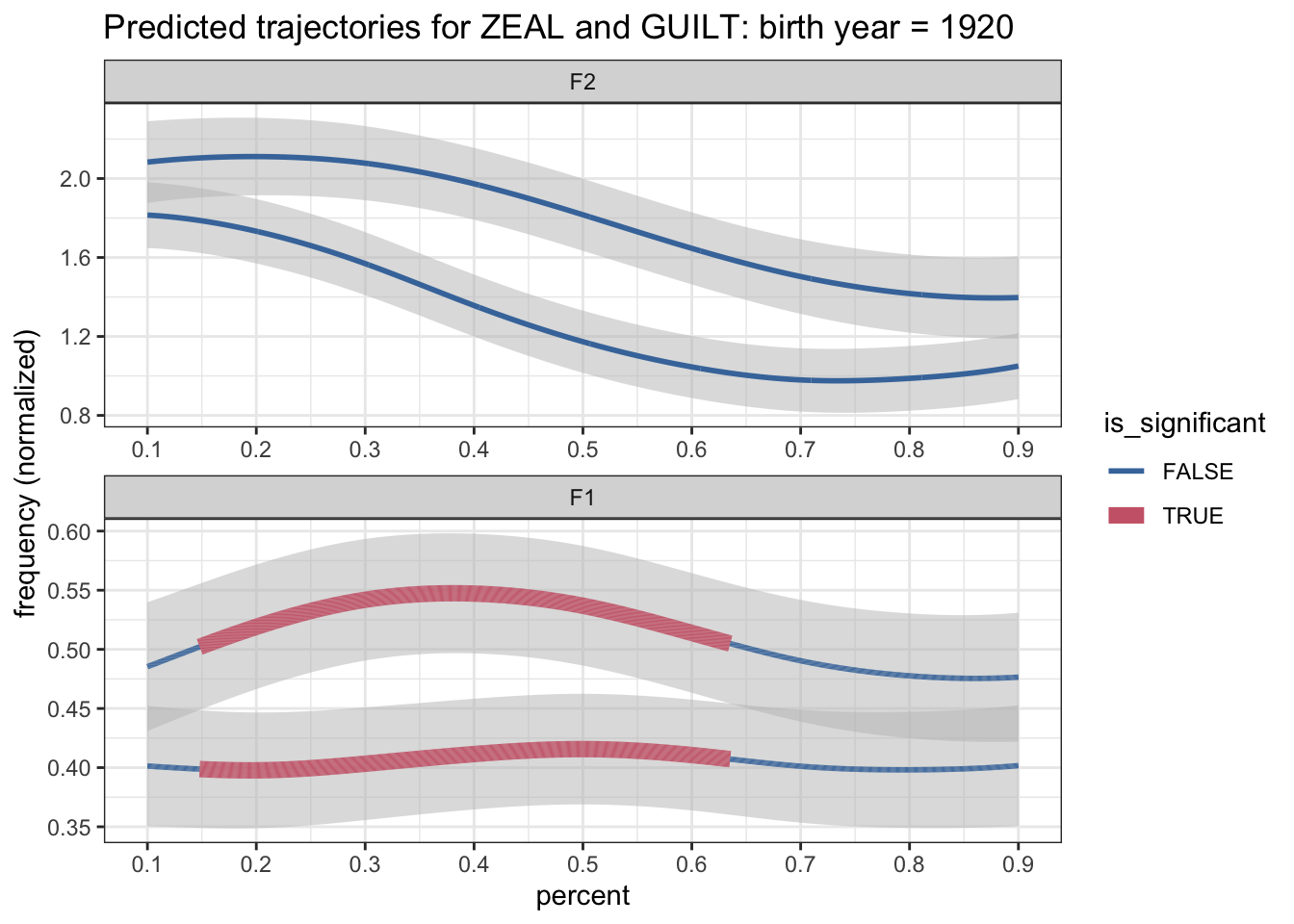
Well shoot. What’s wrong with this plot? I see two things. First, while the significance was accurately detected for F1, it was not for F2 for some reason. The second problem is that we’ve got color for significance rather than by allophone. Let’s fix both of these, starting with the first.
A more robust method
The code we did for detecting significance was this. Keep in mind that this is just one chunk of our pipeline that I’ve separated for illustrative purposes and it’s not going to run by itself.
# Calculate the difference
mutate(is_significant = hz_norm_ZEAL + CI_ZEAL < hz_norm_GUILT - CI_GUILT) %>%
The problem is that this works only if ZEAL is lower than GUILT. Based on the plots, it’s clear that it is, but only for F1. How can we make the calculation more general so that it detects overlaps without us predetermining which one is supposed to be higher?
There are probably a lot of solutions out there, but here’s the solution I came up with. Given each formant, we need to programatically determine which allophone is higher. We could do it as something like this:
mutate(ZEAL_is_higher = hz_norm_ZEAL > hz_norm_GUILT)This would create a new column called ZEAL_is_higher. If ZEAL is indeed higher, the value in that column for that row is TRUE. Otherwise, it’s FALSE. We can now use this information to calculate the confidence interval a little more robustly. I’ve chosen to use case_when instead of if_else: I find the extra typing worth it for the clarity that it offers.
mutate(ZEAL_is_higher = hz_norm_ZEAL > hz_norm_GUILT,
       is_significant = case_when(ZEAL_is_higher  ~ hz_norm_ZEAL - CI_ZEAL > hz_norm_GUILT + CI_GUILT,
                                  !ZEAL_is_higher ~ hz_norm_ZEAL + CI_ZEAL < hz_norm_GUILT - CI_GUILT)) %>%
So what this does is it first determines if ZEAL is higher than GUILT. If it is, then it’ll see if the confidence interval of ZEAL is higher than the confidence interval of GUILT. If it’s lower, it’ll see if it’s lower.
For this to work, we’ll need to do this independently for each formant. And for good measure, we should do it independently for each birth year and each percent as well.
group_by(formant, yob, percent) %>%
mutate(ZEAL_is_higher = hz_norm_ZEAL > hz_norm_GUILT,
       is_significant = case_when(ZEAL_is_higher  ~ hz_norm_ZEAL - CI_ZEAL > hz_norm_GUILT + CI_GUILT,
                                  !ZEAL_is_higher ~ hz_norm_ZEAL + CI_ZEAL < hz_norm_GUILT - CI_GUILT)) %>%
If we incorporate this into our pipeline, we should have made an improvement to our plot.
preds %>%
  filter(yob == 1920) %>%

  # Reshape
  pivot_wider(names_from = allophone, values_from = c(hz_norm, CI)) %>%

  # Calculate the difference
  group_by(formant, yob, percent) %>%
  mutate(ZEAL_is_higher = hz_norm_ZEAL > hz_norm_GUILT,
         is_significant = case_when(ZEAL_is_higher  ~ hz_norm_ZEAL - CI_ZEAL > hz_norm_GUILT + CI_GUILT,
                                    !ZEAL_is_higher ~ hz_norm_ZEAL + CI_ZEAL < hz_norm_GUILT - CI_GUILT)) %>%

  pivot_longer(cols = c(matches("hz_norm"), matches("CI")),
               names_to = c(".value", "allophone"),
               names_pattern = "(.+)_([A-Z]+)\\Z") %>%

  mutate(formant = fct_rev(formant)) %>%
  ggplot(aes(percent, hz_norm, group = allophone)) +
  geom_ribbon(aes(ymin = hz_norm - CI, ymax = hz_norm + CI), fill = "grey75", alpha = 0.5) +
  geom_path(aes(color = is_significant, size = is_significant)) +
  scale_x_continuous(breaks = seq(0, 1, by = 0.1)) +
  scale_size_manual(values = c(1, 3)) +
  scale_color_ptol() +
  facet_wrap(~formant, ncol = 1, scales = "free") +
  labs(title = "Predicted trajectories for ZEAL and GUILT: birth year = 1920",
       y = "frequency (normalized)") +
  theme_bw()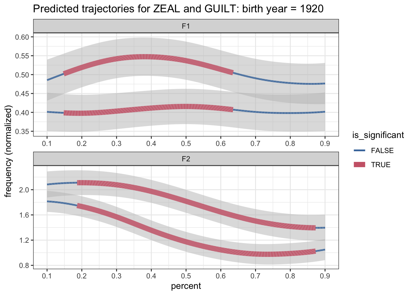
Success! The plot is still bad, but it at least has correctly detected regions of significance for both F1 ad F2. Now we need to figure out how to fix the colors.
Add gray for non-significance
The core of the problem is that we are actually mapping two pieces of information to a single aesthetic: allophone and significance. This is something that is normally not done in ggplot2. So, we’re going to go about it in a bit of a hacky way. Basically, what we need to do is expand our case_when function above to three levels: “ZEAL”, “GUILT”, and “not significant.” Fortunately, this is pretty straightforward to do. Here’s what the code looks like:
mutate(allophone_plus_sig = case_when(!is_significant ~ "not significant",
                                      TRUE ~ as.character(allophone)),
       allophone_plus_sig = factor(allophone_plus_sig, levels = c("ZEAL", "GUILT", "not significant")))
What it does is it creates a new column, allophone_plus_sig. For each row in the spreadsheet, if it’s not significant, or rather if is_significant is FALSE, then the value in the new allophone_plus_sig column is set to “not significant”. Otherwise, it’ll just take the value from the allophone column, which, in our case, is "ZEAL" or "GUILT". The reason why allophone is wrapped in as.character() is because case_when requires all output values to be of the same type, and since "not significant" is a string, specifically a character vector, I have to turn allophone, a factor, into a character vector. Don’t worry too much about it. But, I guess what I need to do is then turn that three-way allophone_plus_sig back into a factor, which allows me to control the ordering.
Okay, so now we’re ready to incorporate that back into the pipeline. Because we’re using information about the allophone column, it has to happen after our retransformation back into the original format. Here’s the completed pipeline, and plot.
preds %>%
  filter(yob == 1920) %>%

  # Reshape
  pivot_wider(names_from = allophone, values_from = c(hz_norm, CI)) %>%

  # Calculate the difference
  group_by(formant, yob, percent) %>%
  mutate(ZEAL_is_higher = hz_norm_ZEAL > hz_norm_GUILT,
         is_significant = case_when(ZEAL_is_higher  ~ hz_norm_ZEAL - CI_ZEAL > hz_norm_GUILT + CI_GUILT,
                                    !ZEAL_is_higher ~ hz_norm_ZEAL + CI_ZEAL < hz_norm_GUILT - CI_GUILT)) %>%

  pivot_longer(cols = c(matches("hz_norm"), matches("CI")),
               names_to = c(".value", "allophone"),
               names_pattern = "(.+)_([A-Z]+)\\Z") %>%

  # Add three-way significance + allophone
  mutate(allophone_plus_sig = case_when(!is_significant ~ "not significant",
                                        TRUE ~ as.character(allophone)),
         allophone_plus_sig = factor(allophone_plus_sig, levels = c("ZEAL", "GUILT", "not significant"))) %>%

  mutate(formant = fct_rev(formant)) %>%
  ggplot(aes(percent, hz_norm, group = allophone)) +
  geom_ribbon(aes(ymin = hz_norm - CI, ymax = hz_norm + CI), fill = "grey75", alpha = 0.5) +
  geom_path(aes(color = allophone_plus_sig, size = is_significant)) +
  scale_x_continuous(breaks = seq(0, 1, by = 0.1)) +
  scale_size_manual(values = c(1, 3)) +
  scale_color_ptol() +
  facet_wrap(~formant, ncol = 1, scales = "free") +
  labs(title = "Predicted trajectories for ZEAL and GUILT: birth year = 1920",
       y = "frequency (normalized)") +
  theme_bw()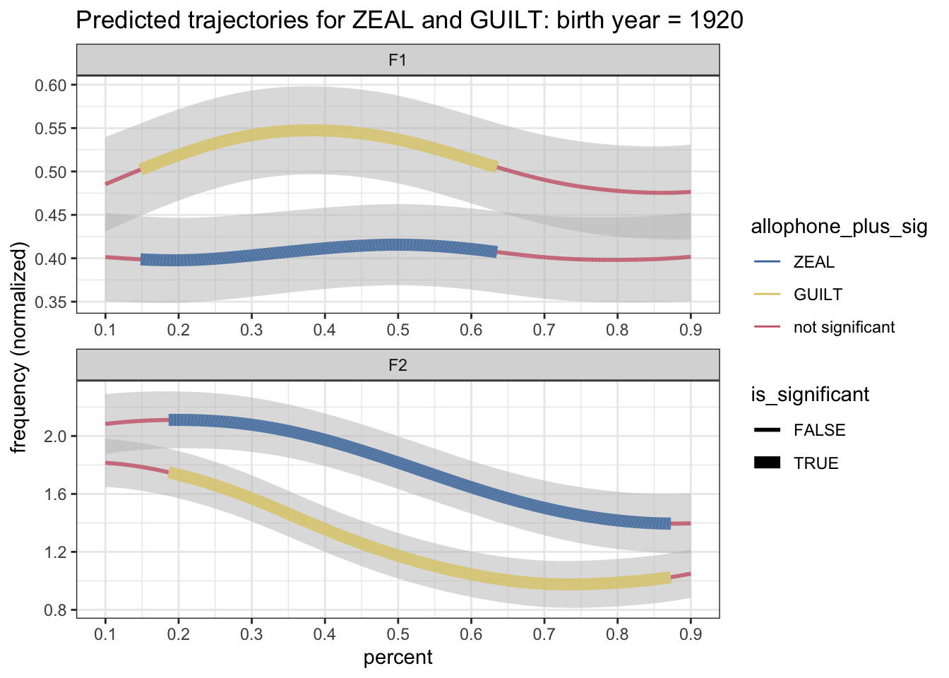
Hooray! It looks like it works. Now what we’ll do is set the colors ourselves. Because I’m adding gray to the mix, I can’t use scale_color_ptol anymore and I’ll have to use scale_color_discrete and tell it the colors I want manually. I’ll use ptol_pal() to access those same blue and red colors though and then I’ll add gray as a third option.
preds %>%
  filter(yob == 1920) %>%

  # Reshape
  pivot_wider(names_from = allophone, values_from = c(hz_norm, CI)) %>%

  # Calculate the difference
  group_by(formant, yob, percent) %>%
  mutate(ZEAL_is_higher = hz_norm_ZEAL > hz_norm_GUILT,
         is_significant = case_when(ZEAL_is_higher  ~ hz_norm_ZEAL - CI_ZEAL > hz_norm_GUILT + CI_GUILT,
                                    !ZEAL_is_higher ~ hz_norm_ZEAL + CI_ZEAL < hz_norm_GUILT - CI_GUILT)) %>%

  # Revert the shape
  pivot_longer(cols = c(matches("hz_norm"), matches("CI")),
               names_to = c(".value", "allophone"),
               names_pattern = "(.+)_([A-Z]+)\\Z") %>%

  # Add three-way significance + allophone
  mutate(allophone_plus_sig = case_when(!is_significant ~ "not significant",
                                        TRUE ~ as.character(allophone)),
         allophone_plus_sig = factor(allophone_plus_sig, levels = c("ZEAL", "GUILT", "not significant"))) %>%

  mutate(formant = fct_rev(formant)) %>%
  ggplot(aes(percent, hz_norm, group = allophone)) +
  geom_ribbon(aes(ymin = hz_norm - CI, ymax = hz_norm + CI), fill = "grey75", alpha = 0.5) +
  geom_path(aes(color = allophone_plus_sig, size = is_significant)) +
  scale_x_continuous(breaks = seq(0, 1, by = 0.1)) +
  scale_size_manual(values = c(0.5, 1)) +
  scale_color_manual(values = c(ptol_pal()(2), "gray50")) +
  facet_wrap(~formant, ncol = 1, scales = "free") +
  labs(title = "Predicted trajectories for ZEAL and GUILT: birth year = 1920",
       y = "frequency (normalized)") +
  theme_bw()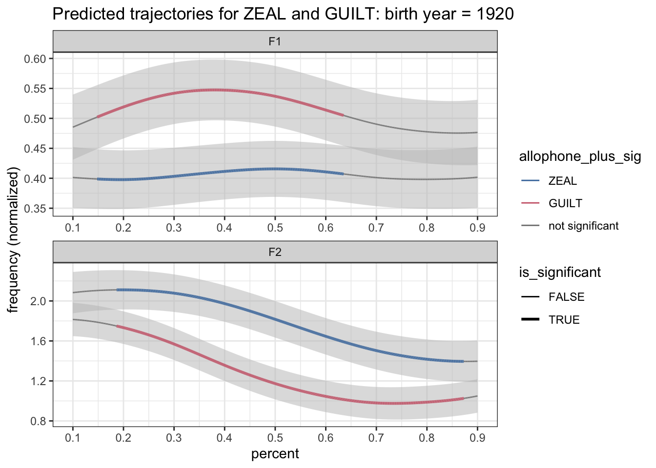
Hey, we’re looking pretty good! The plot is really starting to come together!
Finding transition points
The last thing we need to do for indicating significance is finding the transition points and adding that black vertical dotted line. For some reason this is a harder task than I feel like it should be. It’s easy to spot visually, but not quite as easy for the computer to do it. Maybe I’m doing it wrong, but here’s how I do it.
As a reminder, here’s what our current dataset looks like just before it gets plotted.
preds %>%
  filter(yob == 1920) %>%

  # Reshape
  pivot_wider(names_from = allophone, values_from = c(hz_norm, CI)) %>%

  # Calculate the difference
  group_by(formant, yob, percent) %>%
  mutate(ZEAL_is_higher = hz_norm_ZEAL > hz_norm_GUILT,
         is_significant = case_when(ZEAL_is_higher  ~ hz_norm_ZEAL - CI_ZEAL > hz_norm_GUILT + CI_GUILT,
                                    !ZEAL_is_higher ~ hz_norm_ZEAL + CI_ZEAL < hz_norm_GUILT - CI_GUILT)) %>%

  # Revert the shape
  pivot_longer(cols = c(matches("hz_norm"), matches("CI")),
               names_to = c(".value", "allophone"),
               names_pattern = "(.+)_([A-Z]+)\\Z") %>%

  # Add three-way significance + allophone
  mutate(allophone_plus_sig = case_when(!is_significant ~ "not significant",
                                        TRUE ~ as.character(allophone)),
         allophone_plus_sig = factor(allophone_plus_sig, levels = c("ZEAL", "GUILT", "not significant"))) %>%

  mutate(formant = fct_rev(formant)) %>%
  print()
# A tibble: 4,004 × 9
# Groups: formant, yob, percent [2,002]
formant percent yob ZEAL_is_higher is_significant allophone hz_norm CI
<fct> <dbl> <int> <lgl> <lgl> <chr> <dbl> <dbl>
1 F1 0.1 1920 FALSE FALSE ZEAL 0.401 0.0509
2 F1 0.1 1920 FALSE FALSE GUILT 0.485 0.0544
3 F1 0.101 1920 FALSE FALSE ZEAL 0.401 0.0509
4 F1 0.101 1920 FALSE FALSE GUILT 0.486 0.0544
5 F1 0.102 1920 FALSE FALSE ZEAL 0.401 0.0508
6 F1 0.102 1920 FALSE FALSE GUILT 0.486 0.0544
7 F1 0.102 1920 FALSE FALSE ZEAL 0.401 0.0508
8 F1 0.102 1920 FALSE FALSE GUILT 0.486 0.0544
9 F1 0.103 1920 FALSE FALSE ZEAL 0.401 0.0508
10 F1 0.103 1920 FALSE FALSE GUILT 0.486 0.0544
# ℹ 3,994 more rows
# ℹ 1 more variable: allophone_plus_sig <fct>The key is that is_significant column. At some point, all those FALSE values will switch to TRUE. We need to add some new column that indicates where that switch happens. The problem is that tidyverse functions—which this workflow is heavily entrenched in—generally run one row at a time. It’s difficult get some function to interact with some other row without flat out writing a for loop. I’d rather keep all my data processing in a single pipeline if possible, so we’ll have to think of some way to do this.
The secret, I’ve found is with the lag or lead functions. To illustrate what they do, let’s take a single, arbitrary list of colors:
colors <- tibble(colors = c("red", "yellow", "blue", "green"))
colors
# A tibble: 4 × 1
colors
<chr>
1 red
2 yellow
3 blue
4 green What lag does is it takes that list, shifts all the elements of that list down by one, and puts an NA at the beginning. Basically, it returns what the next element of the list is. lead does the opposite and shifts all the elements up by one slot. For more information on lead and lag, see the documentation.
colors %>%
  mutate(prev_color = lag(colors),
         next_color = lead(colors))
# A tibble: 4 × 3
colors prev_color next_color
<chr> <chr> <chr>
1 red <NA> yellow
2 yellow red blue
3 blue yellow green
4 green blue <NA> So, this can be very useful for us. We want to look at that is_significant column and find rows where the next row is not the same as the current row. So we want to find places where lead(is_significant) is not the same as is_significant.
So, the key piece of code we need is this:
mutate(switch = is_significant != lead(is_significant))Now, we have to be careful about how this is done. Because we have data from lots of years and both formants all pooled together, we want to make sure that they don’t mess each other up. So, we’ll add a group_by function to make sure that the code runs independently for each formant and each year of birth. Otherwise, we might have cases where the offset of one year is compared against the onset of another year, and that’s not what we want. For good measure I’ll also make sure the data is sorted by percent just in case things got out of order at some point.
So the code we need to insert now is this block:
group_by(formant, yob) %>%
arrange(formant, yob, percent) %>%
mutate(switch = is_significant != lead(is_significant)) %>%
ungroup()
I’ll go ahead and insert that right after we find the significance. Here’s the full data processing pipeline now:
preds %>%
  filter(yob == 1920) %>%

  # Reshape
  pivot_wider(names_from = allophone, values_from = c(hz_norm, CI)) %>%

  # Calculate the difference
  group_by(formant, yob, percent) %>%
  mutate(ZEAL_is_higher = hz_norm_ZEAL > hz_norm_GUILT,
         is_significant = case_when(ZEAL_is_higher  ~ hz_norm_ZEAL - CI_ZEAL > hz_norm_GUILT + CI_GUILT,
                                    !ZEAL_is_higher ~ hz_norm_ZEAL + CI_ZEAL < hz_norm_GUILT - CI_GUILT)) %>%

  # Find where the switches happen
  group_by(formant, yob) %>%
  arrange(formant, yob, percent) %>%
  mutate(switch = is_significant != lead(is_significant)) %>%
  ungroup() %>%

  # Revert the shape
  pivot_longer(cols = c(matches("hz_norm"), matches("CI")),
               names_to = c(".value", "allophone"),
               names_pattern = "(.+)_([A-Z]+)\\Z") %>%


  # Add three-way significance + allophone
  mutate(allophone_plus_sig = case_when(!is_significant ~ "not significant",
                                        TRUE ~ as.character(allophone)),
         allophone_plus_sig = factor(allophone_plus_sig, levels = c("ZEAL", "GUILT", "not significant"))) %>%

  mutate(formant = fct_rev(formant)) %>%
  print()
# A tibble: 4,004 × 10
formant percent yob ZEAL_is_higher is_significant switch allophone hz_norm
<fct> <dbl> <int> <lgl> <lgl> <lgl> <chr> <dbl>
1 F1 0.1 1920 FALSE FALSE FALSE ZEAL 0.401
2 F1 0.1 1920 FALSE FALSE FALSE GUILT 0.485
3 F1 0.101 1920 FALSE FALSE FALSE ZEAL 0.401
4 F1 0.101 1920 FALSE FALSE FALSE GUILT 0.486
5 F1 0.102 1920 FALSE FALSE FALSE ZEAL 0.401
6 F1 0.102 1920 FALSE FALSE FALSE GUILT 0.486
7 F1 0.102 1920 FALSE FALSE FALSE ZEAL 0.401
8 F1 0.102 1920 FALSE FALSE FALSE GUILT 0.486
9 F1 0.103 1920 FALSE FALSE FALSE ZEAL 0.401
10 F1 0.103 1920 FALSE FALSE FALSE GUILT 0.486
# ℹ 3,994 more rows
# ℹ 2 more variables: CI <dbl>, allophone_plus_sig <fct>We now have a new switch column that is true only if the next timepoint’s significance is different from the current timepoint.
We can now incorporate that into the plot. I’ll add the vertical line with geom_vline.
preds %>%
  filter(yob == 1920) %>%

  # Reshape
  pivot_wider(names_from = allophone, values_from = c(hz_norm, CI)) %>%

  # Calculate the difference
  group_by(formant, yob, percent) %>%
  mutate(ZEAL_is_higher = hz_norm_ZEAL > hz_norm_GUILT,
         is_significant = case_when(ZEAL_is_higher  ~ hz_norm_ZEAL - CI_ZEAL > hz_norm_GUILT + CI_GUILT,
                                    !ZEAL_is_higher ~ hz_norm_ZEAL + CI_ZEAL < hz_norm_GUILT - CI_GUILT)) %>%

  # Find where the switches happen
  group_by(formant, yob) %>%
  arrange(formant, yob, percent) %>%
  mutate(switch = is_significant != lead(is_significant)) %>%
  ungroup() %>%

  # Revert the shape
  pivot_longer(cols = c(matches("hz_norm"), matches("CI")),
               names_to = c(".value", "allophone"),
               names_pattern = "(.+)_([A-Z]+)\\Z") %>%


  # Add three-way significance + allophone
  mutate(allophone_plus_sig = case_when(!is_significant ~ "not significant",
                                        TRUE ~ as.character(allophone)),
         allophone_plus_sig = factor(allophone_plus_sig, levels = c("ZEAL", "GUILT", "not significant"))) %>%

  mutate(formant = fct_rev(formant)) %>%

  # Plot
  ggplot(aes(percent, hz_norm, group = allophone)) +
  geom_ribbon(aes(ymin = hz_norm - CI, ymax = hz_norm + CI), fill = "grey75", alpha = 0.5) +
  geom_path(aes(color = allophone_plus_sig, size = is_significant)) +
  geom_vline(data = . %>% filter(switch == TRUE), aes(xintercept = percent), linetype = "dotted") +
  scale_x_continuous(breaks = seq(0, 1, by = 0.1)) +
  scale_size_manual(values = c(0.5, 1)) +
  scale_color_manual(values = c(ptol_pal()(2), "gray50")) +
  facet_wrap(~formant, ncol = 1, scales = "free") +
  labs(title = "Predicted trajectories for ZEAL and GUILT: birth year = 1920",
       y = "frequency (normalized)") +
  theme_bw()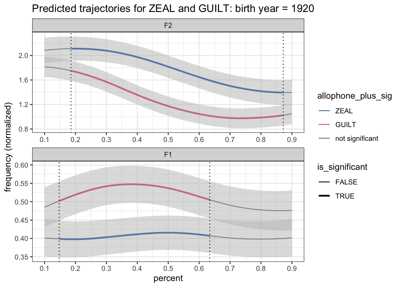
Okay! We’re looking pretty good now. We’ve got a nice looking plot.
Labels on the plots
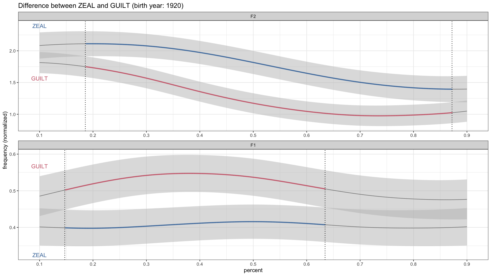
But we’re not done! Not even with the static plot—and we haven’t even gotten to the animations yet! As a reminder, here’s a plot I used in my LSA talk:
The only difference now is that we have a legend still. That legend has been bothering me this whole time and we need to get rid of it. The size is something that probably doesn’t need to be in the legend, and we can do a better job at indicating which color is which vowel. I try to avoid legends if at all possible and instead opt to annotate the plot directly.
As a first step, we can get rid of the legend by adding theme(legend.position = "none") at the end of our plotting code.
preds %>%
  filter(yob == 1920) %>%

  # Reshape
  pivot_wider(names_from = allophone, values_from = c(hz_norm, CI)) %>%

  # Calculate the difference
  group_by(formant, yob, percent) %>%
  mutate(ZEAL_is_higher = hz_norm_ZEAL > hz_norm_GUILT,
         is_significant = case_when(ZEAL_is_higher  ~ hz_norm_ZEAL - CI_ZEAL > hz_norm_GUILT + CI_GUILT,
                                    !ZEAL_is_higher ~ hz_norm_ZEAL + CI_ZEAL < hz_norm_GUILT - CI_GUILT)) %>%

  # Find where the switches happen
  group_by(formant, yob) %>%
  arrange(formant, yob, percent) %>%
  mutate(switch = is_significant != lead(is_significant)) %>%
  ungroup() %>%

  # Revert the shape
  pivot_longer(cols = c(matches("hz_norm"), matches("CI")),
               names_to = c(".value", "allophone"),
               names_pattern = "(.+)_([A-Z]+)\\Z") %>%


  # Add three-way significance + allophone
  mutate(allophone_plus_sig = case_when(!is_significant ~ "not significant",
                                        TRUE ~ as.character(allophone)),
         allophone_plus_sig = factor(allophone_plus_sig, levels = c("ZEAL", "GUILT", "not significant"))) %>%

  mutate(formant = fct_rev(formant)) %>%

  # Plot
  ggplot(aes(percent, hz_norm, group = allophone)) +
  geom_ribbon(aes(ymin = hz_norm - CI, ymax = hz_norm + CI), fill = "grey75", alpha = 0.5) +
  geom_path(aes(color = allophone_plus_sig, size = is_significant)) +
  geom_vline(data = . %>% filter(switch == TRUE), aes(xintercept = percent), linetype = "dotted") +
  scale_x_continuous(breaks = seq(0, 1, by = 0.1)) +
  scale_size_manual(values = c(0.5, 1)) +
  scale_color_manual(values = c(ptol_pal()(2), "gray50")) +
  facet_wrap(~formant, ncol = 1, scales = "free") +
  labs(title = "Predicted trajectories for ZEAL and GUILT: birth year = 1920",
       y = "frequency (normalized)") +
  theme_bw() +
  theme(legend.position = "none")
That at least takes care of removing the legend. But now we need to figure out how to annotate the plot.
A simple solution is to manually put some labels in. That works well if there’s only one plot you need to do. But since you may want to plot many vowel pairs, it gets cumbersome to have to do that every time. Plus, we’ll be animating these, which means the lines could move around and we don’t want to have to reposition the label every time. A better solution would be to programatically generate plot labels.
So what we’ll need to do is take our existing data and generate a new dataset that contains the information for where we want to put the labels. So let’s save the plotting data without actually plotting it.
plotting_data <- preds %>%
  filter(yob == 1920) %>%

  # Reshape
  pivot_wider(names_from = allophone, values_from = c(hz_norm, CI)) %>%

  # Calculate the difference
  group_by(formant, yob, percent) %>%
  mutate(ZEAL_is_higher = hz_norm_ZEAL > hz_norm_GUILT,
         is_significant = case_when(ZEAL_is_higher  ~ hz_norm_ZEAL - CI_ZEAL > hz_norm_GUILT + CI_GUILT,
                                    !ZEAL_is_higher ~ hz_norm_ZEAL + CI_ZEAL < hz_norm_GUILT - CI_GUILT)) %>%

  # Find where the switches happen
  group_by(formant, yob) %>%
  arrange(formant, yob, percent) %>%
  mutate(switch = is_significant != lead(is_significant)) %>%
  ungroup() %>%

  # Revert the shape
  pivot_longer(cols = c(matches("hz_norm"), matches("CI")),
               names_to = c(".value", "allophone"),
               names_pattern = "(.+)_([A-Z]+)\\Z") %>%


  # Add three-way significance + allophone
  mutate(allophone_plus_sig = case_when(!is_significant ~ "not significant",
                                        TRUE ~ as.character(allophone)),
         allophone_plus_sig = factor(allophone_plus_sig, levels = c("ZEAL", "GUILT", "not significant"))) %>%

  mutate(formant = fct_rev(formant))
I’ve found that a good position for the label is to put it near the onset of the vowel, slightly outside of the confidence intervals. So, let’s get those vowel onsets.
label_data <- plotting_data %>%
  filter(percent == min(percent)) %>%
  print()
# A tibble: 4 × 10
formant percent yob ZEAL_is_higher is_significant switch allophone hz_norm
<fct> <dbl> <int> <lgl> <lgl> <lgl> <chr> <dbl>
1 F1 0.1 1920 FALSE FALSE FALSE ZEAL 0.401
2 F1 0.1 1920 FALSE FALSE FALSE GUILT 0.485
3 F2 0.1 1920 TRUE FALSE FALSE ZEAL 2.08
4 F2 0.1 1920 TRUE FALSE FALSE GUILT 1.81
# ℹ 2 more variables: CI <dbl>, allophone_plus_sig <fct>Now, we could just put both labels above the line. Here I’ll take the confidence interval times 1.5 and use that as the vertical position. That way it’s above the shaded area.
ggplot(plotting_data, aes(percent, hz_norm, group = allophone)) +
  geom_ribbon(aes(ymin = hz_norm - CI, ymax = hz_norm + CI), fill = "grey75", alpha = 0.5) +
  geom_path(aes(color = allophone_plus_sig, size = is_significant)) +
  geom_vline(data = . %>% filter(switch == TRUE), aes(xintercept = percent), linetype = "dotted") +
  geom_text(data = label_data, aes(label = allophone, y = hz_norm + 1.5*CI)) +
  scale_x_continuous(breaks = seq(0, 1, by = 0.1)) +
  scale_size_manual(values = c(0.5, 1)) +
  scale_color_manual(values = c(ptol_pal()(2), "gray50")) +
  facet_wrap(~formant, ncol = 1, scales = "free") +
  labs(title = "Predicted trajectories for ZEAL and GUILT: birth year = 1920",
       y = "frequency (normalized)") +
  theme_bw() +
  theme(legend.position = "none")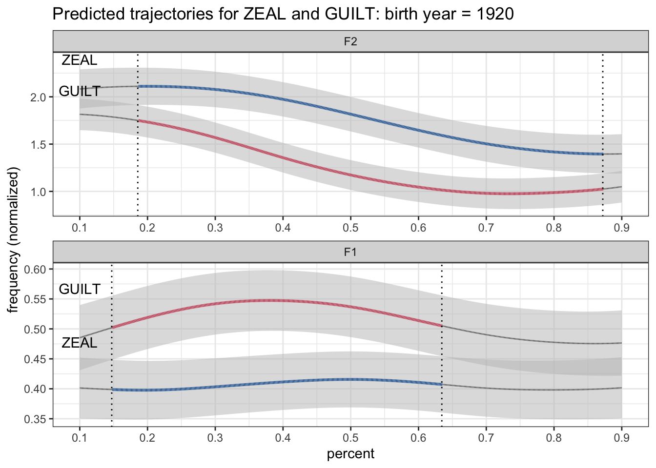
But that doesn’t look too great and are in fact misleading. A better solution would be to put the upper one above the line and the lower one below it. Fortunately, we already know which line is higher because we got the ZEAL_is_higher already figured out. So, with another case_when statement, we can get a higher position for the top one and a lower position for the bottom one. Here’s
label_data <- plotting_data %>%
  filter(percent == min(percent)) %>%
  mutate(label_position = case_when(allophone == "ZEAL"  &  ZEAL_is_higher ~ hz_norm + 1.5*CI,
                                    allophone == "GUILT" &  ZEAL_is_higher ~ hz_norm - 1.5*CI,
                                    allophone == "ZEAL"  & !ZEAL_is_higher ~ hz_norm - 1.5*CI,
                                    allophone == "GUILT" & !ZEAL_is_higher ~ hz_norm + 1.5*CI)) %>%
  print()
# A tibble: 4 × 11
formant percent yob ZEAL_is_higher is_significant switch allophone hz_norm
<fct> <dbl> <int> <lgl> <lgl> <lgl> <chr> <dbl>
1 F1 0.1 1920 FALSE FALSE FALSE ZEAL 0.401
2 F1 0.1 1920 FALSE FALSE FALSE GUILT 0.485
3 F2 0.1 1920 TRUE FALSE FALSE ZEAL 2.08
4 F2 0.1 1920 TRUE FALSE FALSE GUILT 1.81
# ℹ 3 more variables: CI <dbl>, allophone_plus_sig <fct>, label_position <dbl>Now, there are more efficient ways of coding that, but I like to be explicit, so I’ve opted for the slightly more verbose method.
ggplot(plotting_data, aes(percent, hz_norm, group = allophone)) +
  geom_ribbon(aes(ymin = hz_norm - CI, ymax = hz_norm + CI), fill = "grey75", alpha = 0.5) +
  geom_path(aes(color = allophone_plus_sig, size = is_significant)) +
  geom_vline(data = . %>% filter(switch == TRUE), aes(xintercept = percent), linetype = "dotted") +
  geom_text(data = label_data, aes(label = allophone, y = label_position)) +
  scale_x_continuous(breaks = seq(0, 1, by = 0.1)) +
  scale_size_manual(values = c(0.5, 1)) +
  scale_color_manual(values = c(ptol_pal()(2), "gray50")) +
  facet_wrap(~formant, ncol = 1, scales = "free") +
  labs(title = "Predicted trajectories for ZEAL and GUILT: birth year = 1920",
       y = "frequency (normalized)") +
  theme_bw() +
  theme(legend.position = "none")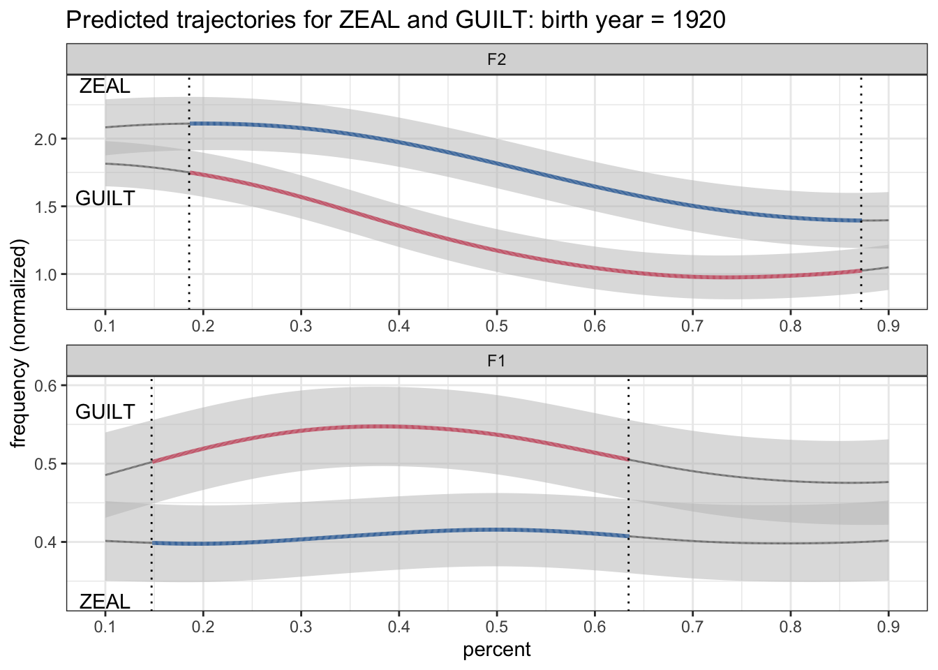
There we go. That’s a little bit better. For good measure, I’m going to also color the text using the same color assigned to the allophones. My first time doing this, I made the mistake of using the allophone_plus_sig column just like the lines. The problem is now I had gray labels, which is not what I wanted.
ggplot(plotting_data, aes(percent, hz_norm, group = allophone)) +
  geom_ribbon(aes(ymin = hz_norm - CI, ymax = hz_norm + CI), fill = "grey75", alpha = 0.5) +
  geom_path(aes(color = allophone_plus_sig, size = is_significant)) +
  geom_vline(data = . %>% filter(switch == TRUE), aes(xintercept = percent), linetype = "dotted") +
  geom_text(data = label_data, aes(label = allophone, y = label_position, color = allophone_plus_sig)) +
  scale_x_continuous(breaks = seq(0, 1, by = 0.1)) +
  scale_size_manual(values = c(0.5, 1)) +
  scale_color_manual(values = c(ptol_pal()(2), "gray50")) +
  facet_wrap(~formant, ncol = 1, scales = "free") +
  labs(title = "Predicted trajectories for ZEAL and GUILT: birth year = 1920",
       y = "frequency (normalized)") +
  theme_bw() +
  theme(legend.position = "none")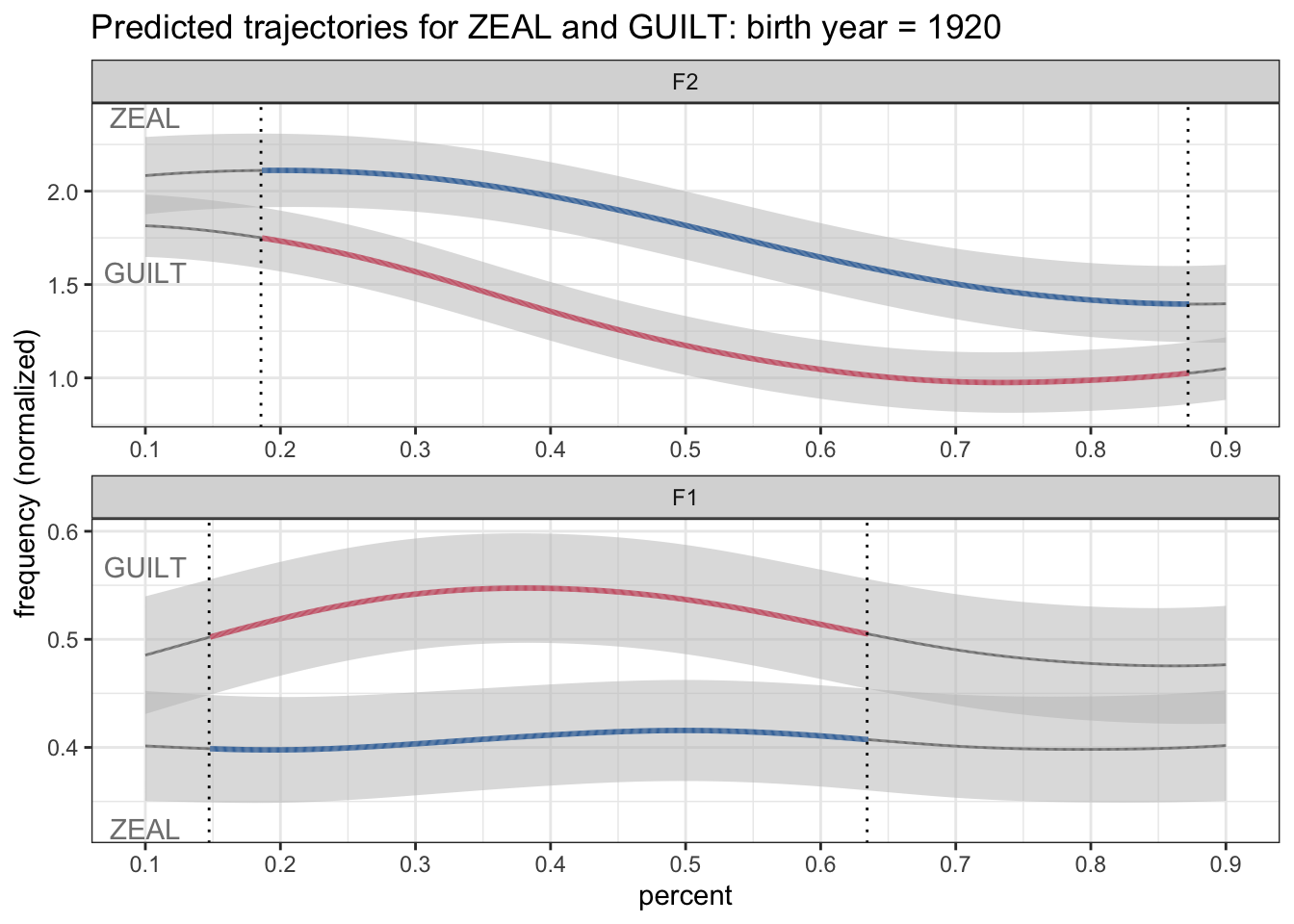
Instead, I should color it using just plain allophone. That way ZEAL is always blue and GUILT is always red, regardless of the significance of the vowel at the onset.
ggplot(plotting_data, aes(percent, hz_norm, group = allophone)) +
  geom_ribbon(aes(ymin = hz_norm - CI, ymax = hz_norm + CI), fill = "grey75", alpha = 0.5) +
  geom_path(aes(color = allophone_plus_sig, size = is_significant)) +
  geom_vline(data = . %>% filter(switch == TRUE), aes(xintercept = percent), linetype = "dotted") +
  geom_text(data = label_data, aes(label = allophone, y = label_position, color = allophone)) +
  scale_x_continuous(breaks = seq(0, 1, by = 0.1)) +
  scale_size_manual(values = c(0.5, 1)) +
  scale_color_manual(values = c(ptol_pal()(2), "gray50")) +
  facet_wrap(~formant, ncol = 1, scales = "free") +
  labs(title = "Predicted trajectories for ZEAL and GUILT: birth year = 1920",
       y = "frequency (normalized)") +
  theme_bw() +
  theme(legend.position = "none")
Okay, now that we’ve got a decent looking plot (at least least it matches the plot I used in my presentation), we can start to work on animating it!
Animate!
The gganimate package is awesome and with just a few lines of code, we can make an animation. The simplest way to think about the animations is that whatever variable you would use in a facet_wrap, you use that as the frames in the animation. In our plot, we are already faceting by formant (F1 and F2), but we want the animation to happen by birth year. Currently we’re only looking at one birth year (1920). In our animation, we would take out that one-year filter and animate along that variable instead.
First, what I’m going to do is regenerate my data so that all birth years are in there.
animating_data <- preds %>%

  # Reshape
  pivot_wider(names_from = allophone, values_from = c(hz_norm, CI)) %>%

  # Calculate the difference
  group_by(formant, yob, percent) %>%
  mutate(ZEAL_is_higher = hz_norm_ZEAL > hz_norm_GUILT,
         is_significant = case_when(ZEAL_is_higher  ~ hz_norm_ZEAL - CI_ZEAL > hz_norm_GUILT + CI_GUILT,
                                    !ZEAL_is_higher ~ hz_norm_ZEAL + CI_ZEAL < hz_norm_GUILT - CI_GUILT)) %>%

  # Find where the switches happen
  group_by(formant, yob) %>%
  arrange(formant, yob, percent) %>%
  mutate(switch = is_significant != lead(is_significant)) %>%
  ungroup() %>%

  # Revert the shape
  pivot_longer(cols = c(matches("hz_norm"), matches("CI")),
               names_to = c(".value", "allophone"),
               names_pattern = "(.+)_([A-Z]+)\\Z") %>%


  # Add three-way significance + allophone
  mutate(allophone_plus_sig = case_when(!is_significant ~ "not significant",
                                        TRUE ~ as.character(allophone)),
         allophone_plus_sig = factor(allophone_plus_sig, levels = c("ZEAL", "GUILT", "not significant"))) %>%

  mutate(formant = fct_rev(formant))

label_data <- animating_data %>%
  filter(percent == min(percent)) %>%
  mutate(label_position = case_when(allophone == "ZEAL"  &  ZEAL_is_higher ~ hz_norm + 1.5*CI,
                                    allophone == "GUILT" &  ZEAL_is_higher ~ hz_norm - 1.5*CI,
                                    allophone == "ZEAL"  & !ZEAL_is_higher ~ hz_norm - 1.5*CI,
                                    allophone == "GUILT" & !ZEAL_is_higher ~ hz_norm + 1.5*CI))
Now, I could make a static plot that includes all the data at once.
ggplot(animating_data, aes(percent, hz_norm, group = allophone)) +
  geom_ribbon(aes(ymin = hz_norm - CI, ymax = hz_norm + CI), fill = "grey75", alpha = 0.5) +
  geom_path(aes(color = allophone_plus_sig, size = is_significant)) +
  geom_vline(data = . %>% filter(switch == TRUE), aes(xintercept = percent), linetype = "dotted") +
  geom_text(data = label_data, aes(label = allophone, y = label_position, color = allophone)) +
  scale_x_continuous(breaks = seq(0, 1, by = 0.1)) +
  scale_size_manual(values = c(0.5, 1)) +
  scale_color_manual(values = c(ptol_pal()(2), "gray50")) +
  facet_wrap(~formant, ncol = 1, scales = "free") +
  labs(title = "Predicted trajectories for ZEAL and GUILT: birth year = 1920",
       y = "frequency (normalized)") +
  theme_bw() +
  theme(legend.position = "none")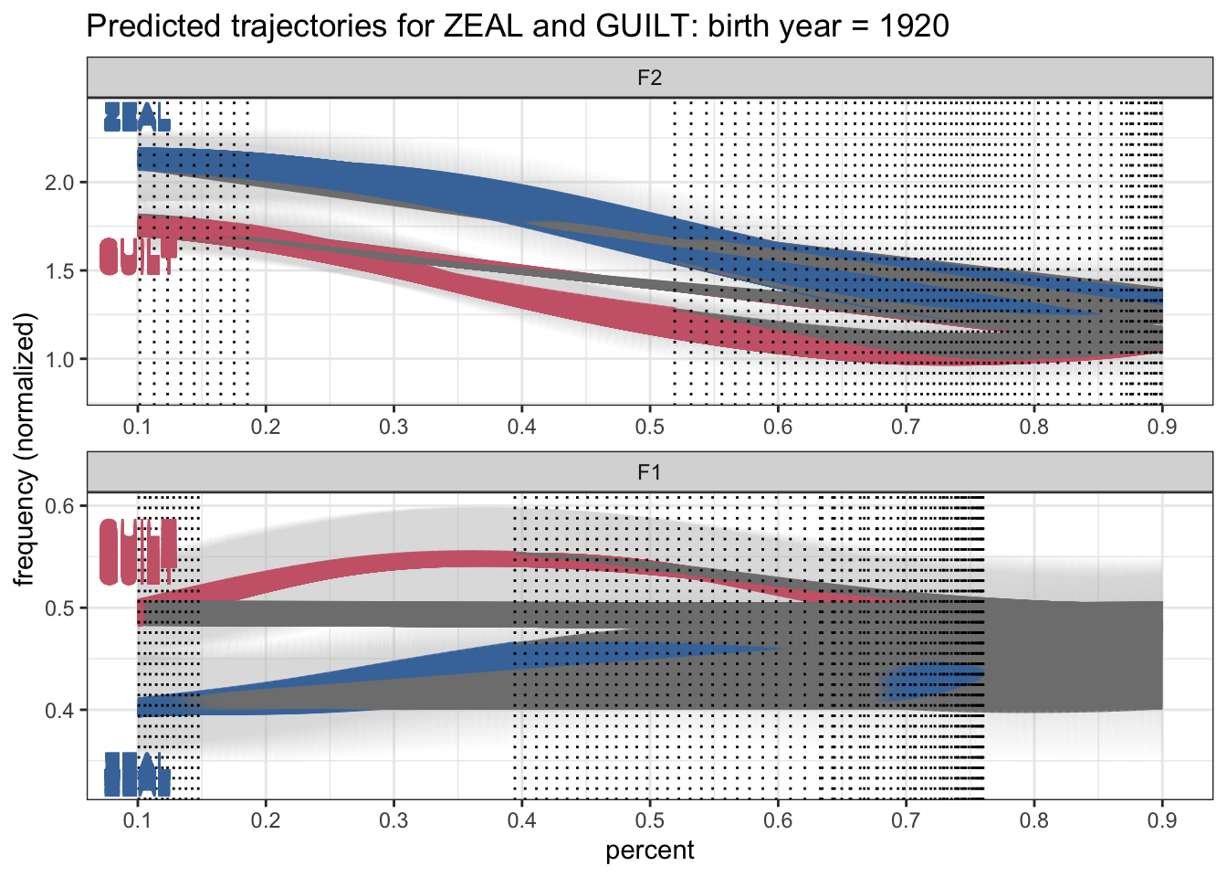
A mess. But that’s fine. We could also make a version of the plot where there’s one panel per birth year.
ggplot(animating_data, aes(percent, hz_norm, group = allophone)) +
  geom_ribbon(aes(ymin = hz_norm - CI, ymax = hz_norm + CI), fill = "grey75", alpha = 0.5) +
  geom_path(aes(color = allophone_plus_sig, size = is_significant)) +
  geom_vline(data = . %>% filter(switch == TRUE), aes(xintercept = percent), linetype = "dotted") +
  geom_text(data = label_data, aes(label = allophone, y = label_position, color = allophone)) +
  scale_x_continuous(breaks = seq(0, 1, by = 0.1)) +
  scale_size_manual(values = c(0.5, 1)) +
  scale_color_manual(values = c(ptol_pal()(2), "gray50")) +
  facet_wrap(yob~formant, scales = "free") +
  labs(title = "Predicted trajectories for ZEAL and GUILT: birth year = 1920",
       y = "frequency (normalized)") +
  theme_bw() +
  theme(legend.position = "none")
So here’s all the information at once. What we need to do now is animate across those birth years. It literally takes one line of code to do this: transition_time(yob). I’ll save the plot into an object called a. I’ll then take that a object and animate it with animate. I’ll specificy the height, width, and resolution. This line of code may take a minute or so. Finally, I’ll export the plot with anim_save, which lets me specify the path and the frames per second.
a <- ggplot(animating_data, aes(percent, hz_norm, group = allophone)) +
  geom_ribbon(aes(ymin = hz_norm - CI, ymax = hz_norm + CI), fill = "grey75", alpha = 0.5) +
  geom_path(aes(color = allophone_plus_sig, size = is_significant)) +
  geom_vline(data = . %>% filter(switch == TRUE), aes(xintercept = percent), linetype = "dotted") +
  geom_text(data = label_data, aes(label = allophone, y = label_position, color = allophone)) +
  scale_x_continuous(breaks = seq(0, 1, by = 0.1)) +
  scale_size_manual(values = c(0.5, 1)) +
  scale_color_manual(values = c(ptol_pal()(2), "gray50")) +
  facet_wrap(~formant, ncol = 1, scales = "free") +
  labs(title = "Predicted trajectories for ZEAL and GUILT: birth year = 1920",
       y = "frequency (normalized)") +
  theme_bw() +
  theme(legend.position = "none") +
  transition_time(yob)
animate(a, height = 7.5, width = 13.33, unit = "in", res = 150)
anim_save(filename = "./plots/lsa2022/lsa2022_temp.gif", fps = 30)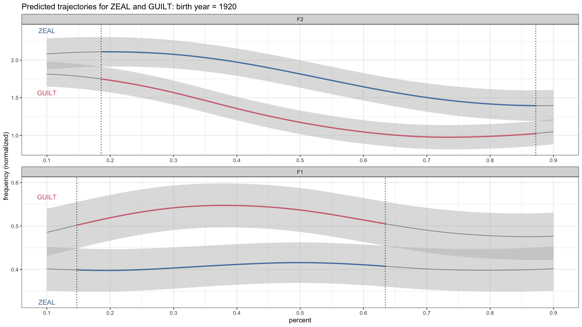
Okay, this is looking pretty good, but there are a few details we’ll want to change. One is that we need to change the title now because it’s not just 1920. Fortunately gganimate has a way to incorporate the year into the title itself. So I’ll chage the title we had in labs so that it incorporates {frame_time}.
Another smaller detail is the vertical black line. You’ll notice that it sort of moves quickly across the screen from left to right even though there’s no corresponding overlap in the confidence intervals. If you look at each plot individually, that line isn’t there. So what’s up with that? What’s actually happening in the data is the black line from the earlier in the gif disappears and then appears later on. So gganimate fills in the gaps because it assumes all the black lines are the same underlying element, so it’ll add transitions between them.
With a little of trial-and-error on my part, I found that that the problem is the group argument in aes. Basically, what it’s doing it assuming that the vertical line “object” should be something that persists across the entire time frame represented here. In reality, we don’t need the thing to persist. There’s no reason why it should be there if it doesn’t have to. Anyway, long story short, to fix it, I’ll add group = yob in geom_vline. That way it’ll treat the vertical from each year as a distinct unit without attempting go connect the dots across time.
a <- ggplot(animating_data, aes(percent, hz_norm, group = allophone)) +
  geom_ribbon(aes(ymin = hz_norm - CI, ymax = hz_norm + CI), fill = "grey75", alpha = 0.5) +
  geom_path(aes(color = allophone_plus_sig, size = is_significant)) +
  geom_vline(data = . %>% filter(switch == TRUE),
             aes(xintercept = percent, group = yob), linetype = "dotted") +
  geom_text(data = label_data, aes(label = allophone, y = label_position, color = allophone)) +
  scale_x_continuous(breaks = seq(0, 1, by = 0.1)) +
  scale_size_manual(values = c(0.5, 1)) +
  scale_color_manual(values = c(ptol_pal()(2), "gray50")) +
  facet_wrap(~formant, ncol = 1, scales = "free") +
  labs(title = paste("Difference between ZEAL and GUILT (birth year: {frame_time})"),
       y = "frequency (normalized)") +
  theme_bw() +
  theme(legend.position = "none") +
  transition_time(yob)
animate(a, height = 7.5, width = 13.33, unit = "in", res = 150)
anim_save(filename = paste0("./plots/lsa2022/lsa2022_temp.gif"), fps = 10)
At this point, if you have a keen eye, you’ll notice that the black vertical line still kinda hangs out there on the left side for a while. I’ll admit I hadn’t seen that before my LSA presentation so it’s there in the “official” plot too. I don’t quite know how to fix that.
Pulling it all together
So, we now have our visual. Here is the code from start to finish. First, we got the data we wanted to visualize:
animating_data <- preds %>%

  # Reshape
  pivot_wider(names_from = allophone, values_from = c(hz_norm, CI)) %>%

  # Calculate the difference
  group_by(formant, yob, percent) %>%
  mutate(ZEAL_is_higher = hz_norm_ZEAL > hz_norm_GUILT,
         is_significant = case_when(ZEAL_is_higher  ~ hz_norm_ZEAL - CI_ZEAL > hz_norm_GUILT + CI_GUILT,
                                    !ZEAL_is_higher ~ hz_norm_ZEAL + CI_ZEAL < hz_norm_GUILT - CI_GUILT)) %>%

  # Find where the switches happen
  group_by(formant, yob) %>%
  arrange(formant, yob, percent) %>%
  mutate(switch = is_significant != lead(is_significant)) %>%
  ungroup() %>%

  # Revert the shape
  pivot_longer(cols = c(matches("hz_norm"), matches("CI")),
               names_to = c(".value", "allophone"),
               names_pattern = "(.+)_([A-Z]+)\\Z") %>%


  # Add three-way significance + allophone
  mutate(allophone_plus_sig = case_when(!is_significant ~ "not significant",
                                        TRUE ~ as.character(allophone)),
         allophone_plus_sig = factor(allophone_plus_sig, levels = c("ZEAL", "GUILT", "not significant"))) %>%

  mutate(formant = fct_rev(formant))
Then we got a subset of that for the labels, and did some slight processing on that.
label_data <- animating_data %>%
  filter(percent == min(percent)) %>%
  mutate(label_position = case_when(allophone == "ZEAL"  &  ZEAL_is_higher ~ hz_norm + 1.5*CI,
                                    allophone == "GUILT" &  ZEAL_is_higher ~ hz_norm - 1.5*CI,
                                    allophone == "ZEAL"  & !ZEAL_is_higher ~ hz_norm - 1.5*CI,
                                    allophone == "GUILT" & !ZEAL_is_higher ~ hz_norm + 1.5*CI))
Finally, we plotted it.
a <- ggplot(animating_data, aes(percent, hz_norm, group = allophone)) +
  geom_ribbon(aes(ymin = hz_norm - CI, ymax = hz_norm + CI), fill = "grey75", alpha = 0.5) +
  geom_path(aes(color = allophone_plus_sig, size = is_significant)) +
  geom_vline(data = . %>% filter(switch == TRUE),
             aes(xintercept = percent, group = yob), linetype = "dotted") +
  geom_text(data = label_data, aes(label = allophone, y = label_position, color = allophone)) +
  scale_x_continuous(breaks = seq(0, 1, by = 0.1)) +
  scale_size_manual(values = c(0.5, 1)) +
  scale_color_manual(values = c(ptol_pal()(2), "gray50")) +
  facet_wrap(~formant, ncol = 1, scales = "free") +
  labs(title = paste("Difference between ZEAL and GUILT (birth year: {frame_time})"),
       y = "frequency (normalized)") +
  theme_bw() +
  theme(legend.position = "none") +
  transition_time(yob)
animate(a, height = 7.5, width = 13.33, unit = "in", res = 150)
anim_save(filename = paste0("./plots/lsa2022/lsa2022_temp.gif"), fps = 10)
Now if you want to get fancy, you could wrap all this up into a function so that it can be applied to whatever vowel pair you want to visualize in your data. That’s what I ended up having to do, which is how I got my four identically-formatted gifs in my presentation. I really like wrapping data viz code into functions because it lets me make lots of plots at once without copying and pasting. Anyway, I’ll let you work that out on your own. 99% of the code is the same and the only differences places where there are explicit mention of the vowel classes. You also of course have to prep the data as well.
And that’s it! Okay, now I expect more people to have animated vowel plots at the next LSA!